Pages

23 Sept 2010

Character Design - Lets start this

Oh boy, writing on two blogs is going to get confusing.

Our second unit running parallel is character design, which to be honest, I was little concerned about. But not anymore. Our first lesson really allowed us to see the depth that we have to put into the characters. 

Its about simplisity as well as creating characters that look good. For example, a Hero must follow the look and style of a hero. This will vary depending on the given topic. All three characters must produce these elements. From analysing the character movie, all the characters have very distinctive clicks that suit them.

Here are the two pictures I drew in class:


This first one is 50 Foot Cowboy. I tried to go down the Godzilla route by making his eyes demonic and henceforth


This second one is a 'Pigmy Secret Agent'. I tried to one again make the face look tribalised and include different objects from both worlds.

The words for my characters are:
Fantasy Arthurian
Now these words are very similar in a way but it allows me to take existing Arturian archtypes, such as Knights and Wizards and really ramp up the fantasy aspect as opposed to making it realistic.

20 Sept 2010

(Temp location) Initial links to Narrative title

(Putting this here until I have author privilages on our Studio blog)

When I first learnt of our Title, a few movies and images came to mind. These encompass a wide range of genres and ages. Here is a few of them:

Attack of... and 50 Foot


The phase 'Attack of' instantly made me think of the 'Godzilla' series created by the Toho Company over in Japan. 'Attack' is obviously on a much smaller scale then 'Invasion' so an attack on, say, a city could be well suited. Godzilla is also a towering being overlooking the city he strides through swiping skyscapers away so 50 ft applies here too.
Alien(s)

Maybe its because Halo Reach came out last week and its on my mind, but with the mention of Aliens, came the covenant from the Halo Series. An alien race hellbent on the destruction of the human race. But then the next topic changed that...

From Toy Land:


Alien + Toy... who doesn't think of the Toy Story aliens. While clearly looking like aliens, they still retain the look of a toy. This is attributed to the way they move more then anything I believe.

As I said before, these were just the first, split second images that popped into my head when we recieved our title. These could be used as initial references for our project or not. Simply my first thoughts.

Year 2 - Retro-Fest Narrative unit

Attack of the 50 Foot Alien(s) from Toy land

That's the title that we have been given. Who do I mean by we:

Earl (not sure who this guy is... I heard he is awesome)
Ethan C
Jolanta
Bob

And what do this super group of people make?

Void Canvas Studio!

With our initial briefing out of the way, I'm going to find some images and references that instantly came to mind when we received our trailer title. To follow all our exploits simply point your browser here:
http://voidcanvas.blogspot.com/

After looking at the trailers that some of the classes before us have done for this unit, we are all expected to do a great job. I fully believe that our Studio can create an amazing trailer and blow those judges away. The work starts now...

(on a side note, Internet Explorer 9 Beta doesn't like the submit button for blog posts. Won't let you click it. Stupid Internet.)

19 Sept 2010

Personal Project - Star Destroyer

Over the past week I decided that I wanted to create a model for my own enjoyment and re-familise myself with Maya before our return. I decided to create a Star Destroyer from Star Wars. I found refernce files on the internet to use as a template and imported them into maya.


So far I have only created the basic geometry and started to add finer detail on the ship itself.


This video shows the basic blocking out of the model and its general size.


Further Model making:


Increased detail in the model making.


Summer Project - Compilation

Hi all.
Here is a compilation of the work that I have been doing for the summer project given to us:

Character Design:

(apologies for scan quality. New scanner being a pain, I'll get the hang of it)


This is the draft for 'Mr Friend'. He will later become Squib the Swig. The reason for the name change was simple really. While looking back at other references and influences for the project, I noticed that the names of the two most iconic platforming game characters are 'Mario' and 'Sonic'. Both names contain 5 letters and are incredibly simple. Coincidence? Maybe, but I decided to rename 'Mr Friend' to 'Squib' and the species of creatures that inhabit this world (the watery enemies and Squib himself) are all called Swigs. 

This is the draft for the enemies of the world. Originally titled 'Mr Baddy', this fellow become 'A Swog', the evil version of our lovable hero. Turned red with rage, the Swogs now follow the main antagonist in a effort to spread the red rage across the peaceful world. Simple enemy design in the same vain as 'Goombas' for Mario and 'Badniks' for Sonic.


This is the draft for Squibs nemesis, the then called 'Mr Evil'. Now named 'Swigger', this boss towers over our hero and appears in every level. Squib also gets past him though (obviously). Created to be a towering figure in the game, the music is meant to strike fear into the children playing it, followed by a quick boost of musical joy.


This is the scale of Squib and Swigger next to each other, the character of Swigger looks menacing at Squib that then runs swiftly past.


A spring board used in the game world to create extra height and distance for the characters.

Leveled out Playblast:


This Playblast allows me to see how I need to place out the level and the basic timing of the music 

Level Pre-Construction


This is the next step of the creation process. I added some basic textures to the enemies and ground and rendered through it.

Level after Construction:


This is the constructed level. I added coins to enhance that game world, as well as Mario and Sonic style blocks in the background for depth. I also added plain white clouds to go along with the simplistic nature. I also added trees into the part of the music that was quieter on the lead up to Swigger, to create some tension. I think the music helps pull this off.

Fly through:


Also, here is a quick playblast fly through of the level to show the scope and how it was put together.

Squib the Swig V1 


I call this V1 because all though it is 'out of Beta' it still needs a level of polish. Some sound effects are out of sync and the running is a bit 'iffy' at the start. I just need to flatten out these scuffles and I'll be be happy with the animation.

I believe it has caught the essence of what I was trying to create, an old school 2D platformer. When I give it it that extra polish, I believe it can shine.

6 Aug 2010

I'm now an Author and Publisher!

kind of...
I got my Year 1 Blog in the post today. Check it:


I'm actually quite surprised by the quality of it. The paper is fantastic and its all so clear. I really am impressed by it and now have all my year 1 blog posts in one great book. It has a dustcover and everything. For just £30 I recommend it to everyone.
I got it from Blurb.co.uk.

Summer Project - Basic Level Design for future reference

Draft 1:

Obviously this level will be changed and optimized many times, but at the moment this the basic idea of where I am going to take it. The silver dots represents the main characters path through the level and the obstacles he overcomes. The level will greatly change when I apply the sound scape to it. This means changing the position of the obstacles and the amount of enemies involved. I have also applied the art style to the image. This design is simplifying to allow me to see what the kind of world I am creating is and the art style involved. The music will heavily influence my final level, meaning every note played will affect the overall layout.

5 Aug 2010

Summer Project - Rough Previs Tests and Sketchs

The 'game' takes places in a very colourful and bright world. The Protaganist will be very bright and fast, and in contrast the enemies will be dark and slow. The world has no place in our own but takes a more twisted view. For example, trees will still look like trees but will have a twist to fit in with the world. The world has no technalogical connection to ours. The laws of physics are still in place in my world but are very loose. The characters can jump higher than any real world counterpart. Jumping on Enemies heads will defeat them and collecting coins is as simple as running into them.


4 Aug 2010

Summer Project - Initial Ideas and References

The sound scape I'll be using for the project is '9'.

The animation I am going to create will take place in a fully 3D world created using Maya. This allows me to fully explore the 3D space and interact with the models created and are necessary for the final animation I will Produce.

Initial Ideas:
Straight away the music is fast and uplifting. It has a feeling of genuine energy and gives me the thought of fast movement.
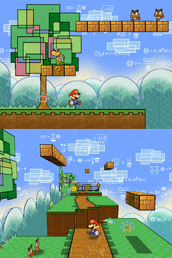
Taking this into consideration, and my own personal interests, I have come up with an idea for a Game-inspired Animation. The music has multiple 'jumps' and 'pitfalls' which is perfect to a platforming type game in the same variation of 'Super Mario' or 'Sonic the Hedgehog'. The music even features a small section for a 'End of Level Boss' to appear.

My initial idea for the project is a side scrolling platform game which stars a small game character that must reach the other end of the level in the fastest time. The art style will be suitably cartoony as if aimed at the younger audience, Playing on the Nintendo Wii or DS. All characters , Protagonist, Antagonist and enemies, will the same core design to imply they are all part of the same world. The visuals will be bright and colourful with the staples of the platforming genre. These is bright blue sky, enemies walking in patterns and so forth.

Due to the speed of the music, the character created will have to move at speed to keep up with it. Due to this, I must make a character that appeals to the audience as well as being athletic looking.

For Example, Mario is a portly Plumber that moves at an adequate speed, while Sonic is known for his speed meaning his design is more slender. I will need to create a variation between the two.

References:

(Sonic the Hedgehog)

(New Super Mario Bros Wii)

(Sonic the Hedgehog HD)

(Super Paper Mario)

(Super Paper Mario)


Mario Game play


Sonic Game play.

Initial Character influence:


A Boy and His Blob
I plan to create a character similar to the Blob. To add athleticism, I plan to add legs for speed and maybe arms to increase the look of momentum.

On a side note, I'll be drawing up sketch's tomorrow and creating a Game storyboard Friday. Then you won't see anything because I'll be on holiday in Portugal, but during this time, I'll be drawing and finalising all character designs and the final layout of the animation. I'm going to have all pre-production done before I come back to ol' blighty because I'll then be building my very own computer for the new year of Uni. Then I can get cracking on the production and have that done by the end of August and spending a week in Post :)
Also what is the date we are back on Phil? My loan goes in on the 20th so I assume its that? Also have we got do any enrollment and the such? Don't know why I'm asking... you'll probably blog post closer to the time but hey ho.

3 Jun 2010

The Book End

And there we have it. The end of the first year at UCA rochester. We are now a few days into the summer holiday and I got to say, am loving the new relaxing that can now be afforded.

See you all in the New uni Year.

(And yes, this post was just to add an end to my Blurb Book)