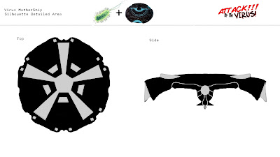
Along side my Animatic and Art Direction I have been fine tuning my designs for the central ships. I have added Gray silhouettes symbolising detailed or different areas then then black area. This is mainly changes in width and height as the point of these ships is not to be super complicated and detailed. The main point is to differentiate the two factions and the feature strong colours and bold lines. I have painted onto them to give a sense of there colour and Cell shading.
The added detailed areas are inspired by both realistic aircraft's and sci-fi influences by there placements. The Mothership is the greater deal of detail due to its larger size and focus in the animation. I have also not added any details that detract from there bold shapes and strong colour palette to keep with the target audience (10-15/12).
I have also detailed the inner tube that the lone White Blood Ship goes through the reach the core of the Virus.
The painted ships each have there unique colour applied to it and are shaded in a similar way to Cell Shading, with strong lines between shaded and not shaded. This gives a clearer definition of each respective ship then the Comic Concept.
The texture that the ships will have will be metallic. The WBCS will be clean and pristine whist the virus will be scratched and scuffed.
7 Mar 2012
Subscribe to:
Post Comments (Atom)


0 comments:
Post a Comment