21 Nov 2009
14 Nov 2009
The Submarine Forest
I'll be honest: when I saw this unit I was dreading it. I'm not a concept artist or any good it but it's something I have to do so I have tried my best and created my first image of three:

The atmosphere has spread forward and faded out while I changed the lighting so it was visible but not overwhelming. The scale image is of a character resting (which happened in the chapter) adds... well, the scale. Fine details were added to make it look 'concepty'.
I have honestly tried my best to create an image and I know it's not as good as my classmates. But I tried right? But I have two more to do...

The atmosphere has spread forward and faded out while I changed the lighting so it was visible but not overwhelming. The scale image is of a character resting (which happened in the chapter) adds... well, the scale. Fine details were added to make it look 'concepty'.
I have honestly tried my best to create an image and I know it's not as good as my classmates. But I tried right? But I have two more to do...
13 Nov 2009
The submarine forest creation
This is my process of creating my submarine forest (We will get to that later)


More colour added to the scene with the bushes. This would be applied to the 'Mid' Layer to make manourvering easier.
1:

Using the guide I posted yesterday, I started to fill in the spaces. I wanted to make sure the path through the middle was the main focus of the scene. The meaning behind this is this chapter is all about an expedition therefore exploration. I wanted to give a sense of 'what's round that corner?'
2:
I focused on the foreground first so I could experiment with depth using colours. The bushes have a mixture of pink and green leaves so I tried to blend the two together but I didn't want it to be 'tonelly bland' (not that mistake again).
3:

More colour added to the scene with the bushes. This would be applied to the 'Mid' Layer to make manourvering easier.
4:
More filling and I've added detail to the foreground trees and ground. Still using the guide obvoiusly.
Not much to say at this stage of the process. KEEP IT IN THE LINES CHILDREN!!!
6:
I filled out the colour some more and started to experiment with the background colour to make it feel underwatery. Not quite yet...
But I have removed the guide to try clearing it up.7:
This is where it starts to take place. I continued to edit the background to give it a 'deep, murky' look. Atmosphere was added to the 'mid' layer by using colour dodge and an opacity change causing a mist effect. I also used colour dodge to create beams of light coming from the trees.
More detail in the objects and I added a shark in the background to simbolise the underwater and the chapter does include a shark.
9:
A scale image has been added so I can get a sense of size. The details not finilized yet. Not till the final one...
12 Nov 2009
The concept guide for tommorow

The above image is a guide that I created to use tommorow in the Concept art lessons. I have created it using just lines as you can tell. No tone, but I did try to add sense depth using different brush sizes. The Plan for tommorow is:
Add colour,
Add tone,
Depth (using colour)
Atmoshere between the layers
I think I might be able to pull this off. On a side note the tablet I have doesn't seem to support 'pen pressure' so I will need to get one from Uni.
10 Nov 2009
Quick post quote
I was just watching the 'Dragon age Origins' Bonus Disc thats in the collecters edition and one quote made me think:
'The concept art for Origins is the make the team pumped to make it and work on it'
So theres the key:
I need to make people excited and to want it.
'The concept art for Origins is the make the team pumped to make it and work on it'
So theres the key:
I need to make people excited and to want it.
9 Nov 2009
How to be Awesome
I need to change my current work on the 'forest' concept art but how is the key.
So heres some things I need to make sure I've done or going to do (with thanks to Simon Holland) :
DON'T be tonely bland: use light or dark tones to 'guide' people around the picture. DO NOT allow the tones and colours to blend together. I'm not trying to make an illistration
Use a focul point to center the work around and continue to build to the strenghs of focusing the persons perception.
Use light sources (I haven't added any yet) not only to add atmosphere and possibly depth but to add a guide for the viewer. I would rather the light to add atmosphere and to enhance the look of the art.
Use a horizon to set perspective. It helps to have a set distance. I can then build 'up' to it or 'down' from it.
Use some sense of Scale. I noticed on Rubens blog that Phil mentioned a use of scale. A human is a simple way of appling scale as we all know the average size of human.
In regard to my 'Submarine Forest) I want it to ooze atmosphere so I have to work on lighting. The issue I am having is the conflict between conventional concept art and the vision I have. I want the forest to be cluttered and full while I'm being told to open it to allow distance and a look at the horizen. I can do that but it then compromises the vision I have for my work.
Maybe Modern Warfare 2 can help me...
So heres some things I need to make sure I've done or going to do (with thanks to Simon Holland) :
DON'T be tonely bland: use light or dark tones to 'guide' people around the picture. DO NOT allow the tones and colours to blend together. I'm not trying to make an illistration
Use a focul point to center the work around and continue to build to the strenghs of focusing the persons perception.
Use light sources (I haven't added any yet) not only to add atmosphere and possibly depth but to add a guide for the viewer. I would rather the light to add atmosphere and to enhance the look of the art.
Use a horizon to set perspective. It helps to have a set distance. I can then build 'up' to it or 'down' from it.
Use some sense of Scale. I noticed on Rubens blog that Phil mentioned a use of scale. A human is a simple way of appling scale as we all know the average size of human.
In regard to my 'Submarine Forest) I want it to ooze atmosphere so I have to work on lighting. The issue I am having is the conflict between conventional concept art and the vision I have. I want the forest to be cluttered and full while I'm being told to open it to allow distance and a look at the horizen. I can do that but it then compromises the vision I have for my work.
Maybe Modern Warfare 2 can help me...
Essay pondering:
Time to start thinking about the forthcoming essay. I'm looking forward to this essay because it allows me to write about the narrative structure and the how the enviroment affects it in games. Plus with the feedback from Phil about my previous essay, I know what fields to change.
I might look at:
How the enviroment effects, or is affected, by the story in 'Uncharted 2: Among Thieves'.
The reason I am leaning towards this game (Except the fact its awesome) is that it has an extremely powerful story and the narrative pushes the game forward. There is no instance in the game where the enviroment is not neccesary. It all developes the characters and the plot itself.
I might look at:
How the enviroment effects, or is affected, by the story in 'Uncharted 2: Among Thieves'.
The reason I am leaning towards this game (Except the fact its awesome) is that it has an extremely powerful story and the narrative pushes the game forward. There is no instance in the game where the enviroment is not neccesary. It all developes the characters and the plot itself.
Concept artists to look at:
Whether or not they relate to your concept art or book, you owe it to yourself to look these guys up:
Henrick Hansen
(Mini Ninjas)
Shinkiro AKA Toshiaki Mori
('CAPCOM vs' series)
Istvan Pely
(Fallout 3)
Ryozo Tsujimoyo
(Monster Hunter Series)
Tatsuya Yoshikawa
(Breath of Fire Series)
Aaron Garbut
(GTA series)
Edward Pun
(inFAMOUS)
Mike Haney
(inFAMOUS)
Victor Antonov
(The Orange Box)
Moby Francke
(The Orange Box)
Jay Epperson
(Henry Hatsworth In The Puzzling Adventure)
Henrick Hansen
(Mini Ninjas)
Shinkiro AKA Toshiaki Mori
('CAPCOM vs' series)
Istvan Pely
(Fallout 3)
Ryozo Tsujimoyo
(Monster Hunter Series)
Tatsuya Yoshikawa
(Breath of Fire Series)
Aaron Garbut
(GTA series)
Edward Pun
(inFAMOUS)
Mike Haney
(inFAMOUS)
Victor Antonov
(The Orange Box)
Moby Francke
(The Orange Box)
Jay Epperson
(Henry Hatsworth In The Puzzling Adventure)
8 Nov 2009
A look at concept art... Part 'the second'
Star Wars:
Iconic movies = WIN!!!


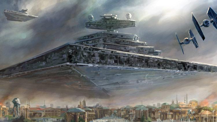
OK fine, I cheated. These images are from Lucasarts 'The Force Unleashed' and Biowares upcoming 'The Old Republic' but they all started at the films. I think the second image is a fantastic showing scale. The star destroyer justs hovers above the city and casts its shadow across it. A lick of atmosphere? Perhaps. Great work all inspired from the brain of one man.
Indiana Jones series:
Just a note: I LOVE INDIANA JONES...
but anyway:

Doesn't these images just ooze atmosphere? The depth really lends itself to the adventure and discovery of the series.
More to follow:
Subscribe to:
Posts (Atom)