Pages

31 Jan 2010

Unit 4: Telling a Story that isn't a load of Crap

Ahhhh, reading week (Mass Effect 2 Week) how I will miss you.

Unit 4 is all about telling a story. This is one unit I have looked forward to proberly the most because I like to think I have knack for story telling. Whenever I had to do a story for school or whatever, I always got really good feedback. I guess the trick to have ideas for a story is cohesivly work them together. This can be hard or easy (Just look at '24' for creating a complete story and telling fantasticly). The workshops with have with Phil (Since he IS writing his own book there is no one better) will really allow us to see different techniques and how to apply them. All in all a unit I want to get stuck into.

Now for my words:

Cat Burgler

Joke Shop:


Fly Paper:

Theres potential for comidic genious but can I pull it off? Tune in next time...

24 Jan 2010

Earl's Awesome Quotes:

Just a spur of the moment kind of thing. You may or may not have noticed my quote at the top of the blog:

You'll get your chance. Important thing is, When it comes you've got to grab it with hands.

I don't know where it came from, or why I like it so much but I just do.

But now its time to introduce a new quote that I came across while looking up 'Bayonetta'.

Theres a time and place for realism. When you're punching God into the sun is not one of those times.

Simply amazing.

21 Jan 2010

Final Backdrop, Set and Scene, Animation Reviews

Here all three Finals:
Backdrop:
Set:
Final Scene:

Ex-ET:
Well the animation went over a treat. Before you can delve into the story, you have to look and analyse everything else about it. The short looks gorgeous and is very well animated. But the music and the animation misleads you into thinking all is well. But is it?
I love the sound effects as they just add that comical feel to the film. And you can't help but love the little kid and his ways.
My personal favourite scene is in the Doctors office. Seeing a child act as every child would in an perfect world is just funny. Then it delves into the uncanny when the child becomes 'drugged'.
Another favourite is when he adjusts the camera. Just little touches like this connect with the story and the world.
The ending was bittersweet but now I know where babies REALLY come from.
Fantastic animation and direction. A really good watch.
KIWI:
Hidden gems. That's what YouTube is for and it is what it produces for the most part. Kiwi is a simple tale of a wingless bird that wants to fly. The story revolves around Kiwi making his perfect plan. The story confuses the viewer at first. Why is he putting trees on the side of the cliff? All resolved with his leap of faith. And this is when the camera shift happens and we see him fly. Yes, we know he is not flying but you want him to. You will him to fly. Once again, its bittersweet because he is falling. There's no escaping that.
The look and sound effects makes Kiwi relatable and you want him succeed. Which he does... till he goes splat.

Our wonderful Nature:
This is a first place animation... and it shows. Straight off, the first impression I got was how good it looked. This is an amazing looking animation. and educational. Nothing wrong with that. Its a tale about a water Shrews love life. When two shrews must fight for the affection of the female, its strangely tense. I don't quite understand but those few seconds of the fight is tense and you eagerly await the victor. How did a 2 second fight evoke that reaction? Skill.
Then the comedy sets in but it doesn't take away from the seriousness it just produced. It adds to it. Plus that fight is awesome (The shrew did a hurricane kick from Street Fighter!!). And it ends with true love. Sex. Shrews live such crazy lives.
This is by far my favourite animation. The fight scene was fantastic, it looked great, it was sweet and funny. And the attention to detail is phenomenal. A pretty underhanded way of winning though.

I remember another animation that used a European style of art to showcase itself.
The story revolves around a small village overseen by a windmill. The village follows the lives of many off its residents in there perfect rudimentary lives. But what does the lighthouse hide? This was different compared to the other animation as it was presented as a cartoon and not a 3D animation. The art style reminds me allot of Professor Layton and is strikingly European. Once again the animation evokes a feeling towards the characters and there lives.

20 Jan 2010

Scene picking: Who are you Backing?

Two scenes, only one winner. I'm asking for to decide because I'm lazy. No, not really. I have my own personal choice but I want an unbiased view.


I like teddy bears. But I also like simplicity. But which is better? Theres only one way to find out... FIGHT!!!!!!

or post in the comments, your choice really.

Edit:

I made the image brighter in response to some comments I got:

19 Jan 2010

And now it renders...

Right... I consider my scene finished. Its now rendering and soon I'll see what the hardwork has produced.

But I must face a stark truth:
If my Teddy Bear doesn't look right or fit into the scene then I WILL remove it. I worked hard on it but I can't let my favourtism get the better of the scene. I think the chair in the moonlight is substational enough but I'll have to wait and see.

*Gulp*

PROBLEM WITH MAYA. Solved

This is typical. I'm getting near the end and I run across this issue.


As you can proberly tell, when I select a face to do whatever too, maya also puts a yellow outline around an opposite face. So when I move the face I have selected it also moves the other random face. Its only just started happening and I have no idea how to fix it. Or how I must of turned it on. This is making modelling impossible. And is really frustrating...

Edit: Sam has fixed it now people. I now owe him my soul...


And now for something completly different:

Heres some maya tutorials:


Backdrop

And heres the backdrop that you'll see out the window.


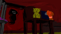
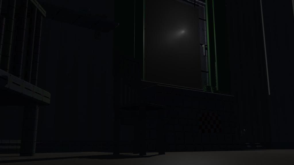
I feel bad. All I have had to do to create the feeling I'm going for is to make a moon.
Yes, it is overly large. I wanted to create a sort of fantasy/horror version but without it being too obvious.
No, there are no stars. I took these out because what do we expect to see when we look up at night? STARS (clouds in Britain). I feel that if I took them out it will fool the audience into thinking something is missing but is not quite sure what it is.

18 Jan 2010

Scene textured and continued

Alllllllll Righty Then.

I've done the texturing for the items and now and starting to nail the lighting. Visibility and pitchblack are not good bedfellows.
http://i654.photobucket.com/albums/uu264/bluejetdude/scenetextured.jpg

Bear in mind that this is not the angle of the render, just a layout of the enviroment.

Time for an 'Earl Mills Trusty Checklist'
To Do:
Teddy Bear : Fur and Texturing
Backdrop
Deciding on camera angle

Textures I have used:


Scene Advancement

I think its really starting to come along. Now for the teddy bear and the backdrop of the moon in the window.

http://i654.photobucket.com/albums/uu264/bluejetdude/scenesofor2.jpg

http://i654.photobucket.com/albums/uu264/bluejetdude/scenesofor3.jpg

Maybe a bit too dark though? I'm trying to get the balance between night time and visibility.

Scene references

Bring on the onslaught of references:


More to come:

Scene so far...

This is the scene so far. Not the camera angle to be used. Just a sweeping shot.
I don't know whether its my own work but I think this already has a feeling of unease.


Scene progress and concept art creation

Just because I haven't posted recently doesn't mean I havent been working...

The components:
Chair:

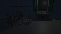
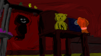
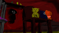
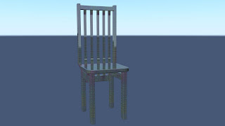
Simple wooden chair that is common place in a small child/babies rooms. Will be center of the room with the EVIL teddy bear atop it.

Cot:

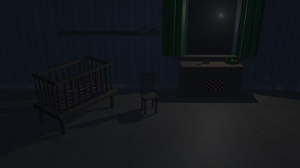
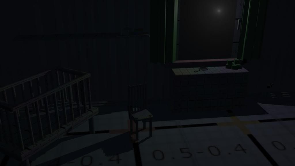
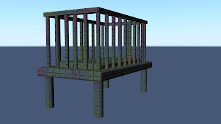
Not as detailed as some of the other objects because I remember a one of the very first lectures where we were told that ' don't waste time and effort modelling and texturing an object that you can only see one side or barely at all. This crib will be in the corner or the foreground so you'll see a corner at the most.

Draws:
Draws (need to be scaled up). Not very clear in this picture but the top extrudes a bit like on all sets of draws. The draws are extruded out to give it a realistic effect. One draw is open to give a living in feel. (Mind add nCloth)
Shelf:

What can I say... its a shelf. Can't really do much with this.

Skirtingboard:

Really simple but adds depth and detail to the wall. Most rooms, if not all, have a skirtingboard. Simples.

Window:

Modelled a window based on the one we made previously made but modified it to look indoorsy.

Curtains:

Curtains. Yep thats right... Curtains. I used 'soft bodies' as opposed to ncloth because I still wanted it to look rigid and structured.

EDIT: These are now considered 'old versions' by yours truely (thats me :) )

More to come...
The concept art to go along with the image.