One way of accomplishing this is a technique called Cel Shading in the video game industry, and Toon Shading in Maya.
The Legend of Zelda: The Windwaker


It was through Nintendos efforts that the visual style became more mainstream. In an effort to differentiate themselves from other games, make a timeless looking game and different from previous entries in the series.
Nintendo changed one aspect of cel shading and that's that they did not include the strong bold outlines featured in other examples. This look softens the overall image, creating a more friendly looking image.
Project
The Cel Shading look makes the CG look more cartoon like without losing the cartoon image. It makes it more accessible to the younger audience. I also like the use, or lack of, strong bold lines. I think it makes it more accessible for all audiences, expanding my target audience but still keeping the focus on 12 year old boys.
Borderlands


Borderlands is a more recent example of cel shading, and one that caused controversy when it was re-revealed as supporting the style. Considered to children, as the technique made the game look more child friendly but in time it became more or a signature of the franchise. In the opposite fashion of 'Windwaker', which removed the bold lines but kept the shading, Borderlands removing the shading and kept the bold outlines. But even then it was used sparingly and not on all objects. It was used as a way to focus the audiences attention onto certain objects and away from others.
Project
The loss of the 'shading' aspect may have helped the game find the market that they were aiming for, but my target audience is younger so fully adopting this approach would be a mistake, but I do like the way they use selective Outlines. Maybe the red blood cells won't be outlined but the WBC and virus will be..?
I test the style with a previs WBC ship:
Roy Lichtenstein
A man that Phil recommended to me, Roy Lichtenstein is an American Pop Artist.

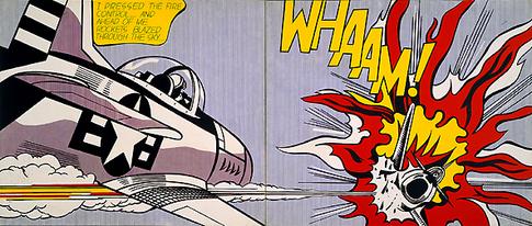
Lichtenstein clearly uses the style of an old comic book, most noticeably the 50s, to great effect. The colours used are limited, so the image is kept clear and not busy. Another aspect, lifted from comic books and emulated with Cel Shading is the bold outlines. Another element that Lichtenstein uses to great effect is the 'dots' that are evident in his work. Reminiscent of the 50s era of comics, it adds an instant time frame to it.
Project
The limitations in colour and the bold lines are definitely areas that I want to use, but I'm not sold on the 'Dots'. I think it ages it to much for the target audience that would be seeing it. I think the best thing to do is to create an amalgamation.
Overall Art Style
The art style that I'm currently aiming for is Cel Shading. This technique allows the animation to take cartoon qualities without becoming one outright. I plan to use the selected outlines of Borderland along with the limitations of colour as shown with Lichtenstein. The use of Cel Shading is purely to enhance the experience for the target audience, as it combines all aspects that the age group is looking for.

0 comments:
Post a Comment